Office Reveal: Part 2
Sharing all the deatails on Part 2 of our home office reveal project, including the design plan, where we got all the things and our favorite part of the room!
A few weeks ago, I shared the Elfa Closet we installed. Then I shared part 1 of our home office reveal and our first-ever ground-up renovation project. If you missed that post, I’d start there and then circle back to this post. Today, I’m back sharing part 2 of the home office makeover which focuses on the design details and final incredible reveal of the space.
Our Home Office: Before
We really liked our downstairs basement and playroom space but we knew that it had so much more potential. We thought about doing a complete gut of the garage, laundry and playroom for a HUGE 100K renovation but in the end, we realized that what we really needed was an office and there was plenty of space in the existing floor plan. Here’s where we started:
We get a lot of use out of this space. Ty works everyday here, we watch TV at night together and we hope that the boys will utilize this space as a play area and movie room when they are older. Here’s a quick peak at the office with the dry wall up:
In the main playroom area we have a toy closet, a large 10’ x 10’ super deep sofa and side tables, a leather chair, coffee table and TV. On the opposite side near the window, we have access to the garage, access to the outside and a large 7’ table that Ty has been using as his desk. This is the area we converted to an office.
Our Home Office: After
To plan for the design of the home office, I created a mood board (you may have seen me share it over on Instagram). After several interations and some instagram polls, we pretty much stuck right to the plan and are thrilled with how it turned out.
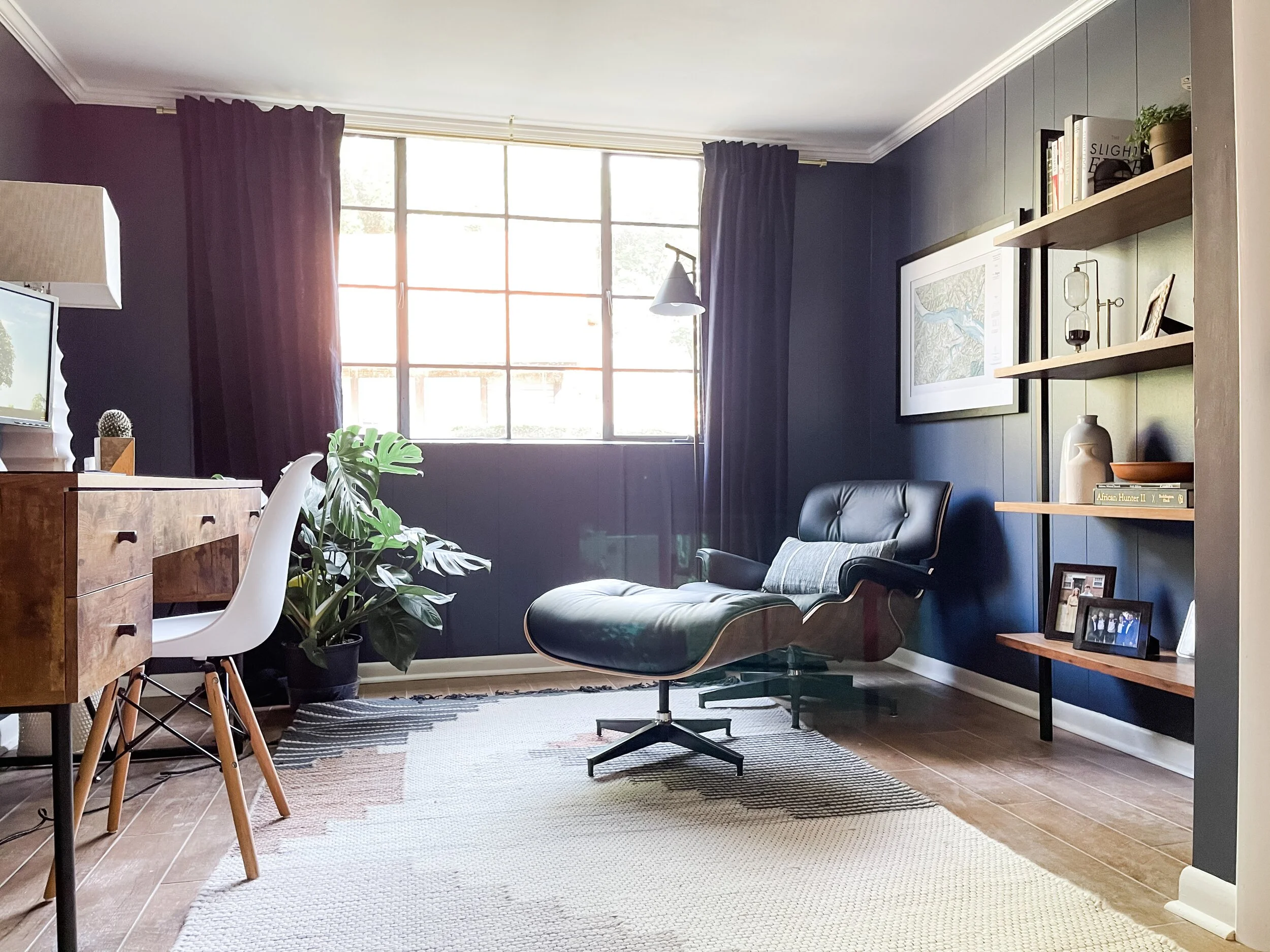
There are a few things that were must haves in the space: a desk, closet, and a comfy chair. Here’s how our home office looks now with everything installed. We didn’t “stage” it or do anything just for the photos. This is really how it looks for Ty each morning when he goes to work.
As you can see we added a few things and swapped out a few things from the original mood board but it stayed pretty true to the design and original feel. This is something that I’ve gotten better at the more rooms we’ve done. In the past I’ve veered from the design because I found a “deal” on something or found another look I liked and wanted to combine it with things I already purchased. This is the first time I have truly committed to the original design from start to finish and I am thrilled with how it turned out.
We added this bookcase to the original design. It was one of those things we saw in the inspo pictures but wanted to get the bigger items like the chair and the desk in the space before committing to it. We thought at one point that we would do a huge piece of art in that spot but turns out we were able to do both. I also swapped the original lamp choice for a more subtle black (instead of the brass).
Another big change was the desk. I really wanted this West Elm desk but when I went to purchase it was no longer available. It turned out to be a happy accident and I love the desk we ended up with even more.
One of the most positive parts of sticking with the plan is that I didn’t feel like I wasted time or money on returning things that didn’t work. I also love the fact that it wasn’t full of trial and error. I pulled together the look from a few inspiration pictures on the front end and that allowed me to paint by number for the rest of the decorating. What do you think of the final result?
And you can see the full closet reveal here.


